Key Takeaways
Stock roofing images make paid traffic feel generic, while real project evidence gives visitors a reason to trust the company behind the ad.
- Use project photos that match the roofing problem in the ad.
- Show local crews, properties, materials, and finished details.
- Keep calls, forms, and trust signals close to the visual proof.
- Build a simple photo process that crews can repeat on every job.
- Measure booked inspections and qualified leads, not just form fills.
Why generic roofing imagery undermines paid traffic performance
A person who clicks a roofing ad is not browsing for decoration. They are trying to decide whether this company can help with a leak, storm damage, an aging roof, or a repair they cannot safely assess themselves. A polished stock image may look clean, but it rarely answers the practical question behind the click: “Can I trust these people with my home?” That question is central to any roof repair company landing page design.
The trust gap between stock shingles and a real roofing company
Stock photography usually shows a perfect roof under perfect light, with no visible crew, property, repair context, or evidence of what happened before the image was taken. It may communicate “roofing” in a broad sense, but it does not establish that a real company has completed work in a place like the visitor’s home.
Real photos carry more useful detail. A damaged flashing point, a replaced section, or a cleanly finished edge gives the visitor something concrete to evaluate. Even imperfect job-site photography can feel more credible when it shows the actual conditions a homeowner is worried about.
How visual sameness makes your company look interchangeable
When every roofing advertiser uses the same aerial roof, smiling homeowner, or close-up of shingles, the page loses its visual identity. The visitor may remember the problem they need fixed, but not why one company deserves the next call.
That sameness also creates a mismatch with paid media. A search ad competes for attention at the moment of intent, and the landing page needs to continue that specific conversation. If the page looks like a template used by dozens of contractors, the company becomes easier to ignore or compare only on price.
Why visitors arriving from Google Ads judge credibility in seconds
Google Ads visitors often arrive with a narrow goal and little patience. They scan the headline, the first image, the phone number, and the first trust signal before deciding whether to stay. This is especially true on mobile, where the first screen may determine whether the visitor calls, scrolls, or returns to the search results.
A roofing page should therefore make credibility visible before the visitor has to study the company’s history. The roofing page examples gathered from live Google Ads campaigns are useful for studying how headlines, forms, offers, and proof work together, even when the exact design should not be copied.
The difference between an attractive image and conversion-focused proof
An attractive image improves the mood of a page. Conversion-focused proof reduces uncertainty. Those are related, but they are not the same job.
Ask what a visitor can learn from each visual. Does it show the type of property, the severity of the issue, the materials used, or the finished result? If not, the image may still be decorative, but it is not doing much to support the decision to request an inspection.
What high-converting roofing landing pages show instead
The strongest roofing pages use visuals as evidence, not filler between blocks of copy. They show enough context for a homeowner to recognize a familiar problem and enough workmanship detail to believe the company can handle it. The goal is not to create a glossy portfolio; it is to shorten the distance between concern and action.
A practical roof landing page template can help organize quote forms, project galleries, reviews, local details, and contact options. The template is only a starting point, though. The photos and wording still need to reflect the actual services, neighborhoods, and jobs the company wants to sell.
Before-and-after roof repair photography
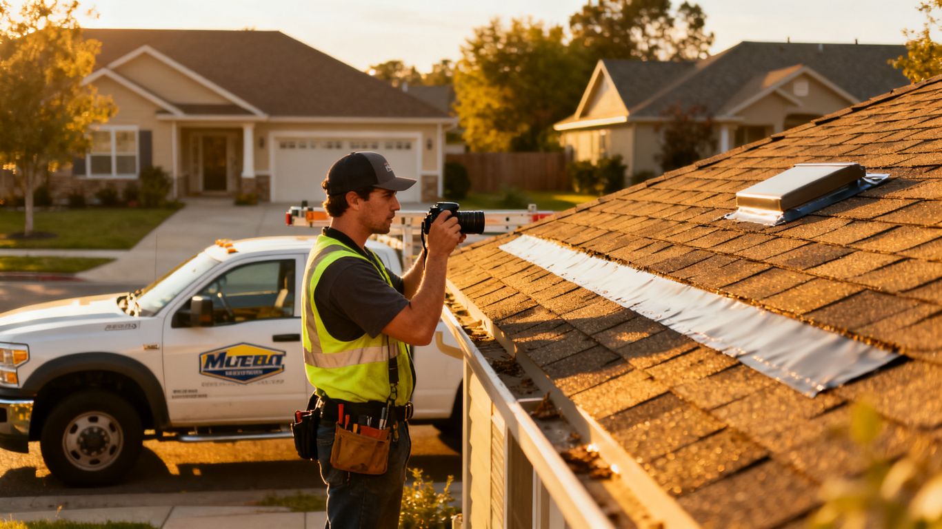
Before-and-after images give the visitor a simple visual sequence: this was the problem, and this was the completed work. They are particularly useful for repairs that are difficult to describe, such as damaged flashing, missing shingles, worn valleys, or water intrusion around a penetration.
Keep the pair consistent when possible. Similar angles, comparable lighting, and a short caption make the change easier to understand. A dramatic “after” image without the “before” context can look attractive, but it does not prove what the crew solved.
Local crews, branded trucks, and identifiable technicians
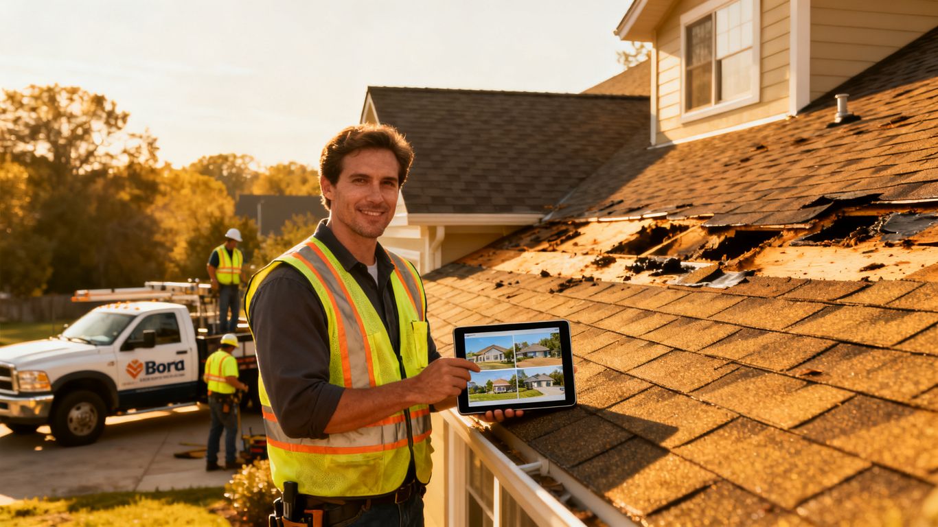
People are more comfortable contacting a company when they can see signs of a real operation. A crew member in appropriate safety equipment, a recognizable service vehicle, or a technician working at a local property can make the business feel present and accountable.
The image does not need to be staged. Candid photos taken during normal work often communicate more than a posed group shot, provided faces and customer details are used with permission. The useful question is whether the image helps a visitor picture who will actually arrive.
Real property types and roofing problems in your service area
A suburban homeowner with a steep asphalt roof may respond to different visual cues than a property manager responsible for a flat commercial roof. The landing page should reflect the property types and repair conditions the campaign is targeting rather than displaying a generic roof that could belong anywhere.
This is also where local relevance becomes practical. A photo of a home with a similar roofline, weather pattern, or neighborhood character can make the page feel familiar without making unsupported claims about serving a particular street or town.
Close-up evidence of workmanship, materials, and completed details
Wide shots establish context, but close-ups help visitors judge care. Show clean flashing, aligned shingles, sealed penetrations, straight trim, protected landscaping, or a properly finished repair where those details are relevant to the service.
Use captions to explain what the visitor is seeing. “Completed repair” is less useful than a plain description of the issue addressed and the visible result. The best detail photos answer a concern before it becomes an objection.
How to build a roof repair company landing page design around customer intent
A landing page should follow the visitor’s reason for searching, not the company’s internal organization chart. Someone searching for emergency leak repair needs a different first message from someone comparing full replacements. This intent-led approach makes the ad, page, image, and call to action feel like one experience.
Start with the service and problem that generated the click. Then decide what proof would reassure that particular visitor, what action they can take immediately, and what additional information can wait until after the first conversion opportunity.
Match the headline to the searcher’s specific roofing problem
A headline about “complete roofing solutions” is broad enough to fit almost any contractor, which is exactly why it tends to be weak. A visitor with storm damage, an active leak, or a suspected ventilation issue should see that problem reflected in the opening message.
Specificity does not require making a promise the company cannot keep. It means naming the service accurately, clarifying the next step, and pairing the headline with an image that supports the same situation.
Use separate pages for leaks, storm damage, replacements, and inspections
One general roofing page forces too many audiences into the same conversation. Separate pages allow the headline, project photos, form questions, and trust information to match the service being requested.
A leak page might prioritize urgency and easy contact. A replacement page may need more information about materials, project scope, and scheduling. An inspection page can focus on what the visit includes and what happens afterward. The structure changes because the intent changes.
Connect ad copy, landing page visuals, and the requested service
A visitor should not have to decode the relationship between the ad and the page. If the ad mentions storm damage, the page should open with storm-related proof. If the ad promotes inspections, the first visual should not imply that every visitor needs a full replacement.
For campaign managers, this alignment is also a useful diagnostic. A low conversion rate may reflect the landing page, but it may also indicate that broad targeting or vague ad copy is sending the wrong people into the page. The message needs to remain coherent from query to click to contact.
Address urgent mobile visitors before explaining your full process
An urgent visitor may want only three answers: do you handle this problem, do you work in my area, and how can I reach you now? Put those answers near the top, especially on mobile. Long company histories and detailed process explanations can come later.
The service-page structure discussed in roofing design guidance follows this practical order: clear offer, immediate contact options, trust signals, and supporting service details. That sequence is more useful than forcing every visitor through the same long introduction.
The conversion elements that should surround your project photos
A strong project image can attract attention, but it cannot finish the conversion by itself. The surrounding copy and controls need to tell the visitor what the company does, why it is credible, and what happens after the click or form submission. Think of the image as evidence placed inside a decision path.
The page should not make visitors hunt for the phone number after showing them a convincing repair. Nor should it put a detailed form beside a photo without explaining what the request will produce. Each element should reinforce the next one.
A specific promise above the fold
The first screen should state the problem addressed, the service offered, and the next step. “Get help with storm damage” is more useful than a vague line about quality roofing, particularly when the ad already established the visitor’s concern.
The promise must remain honest and serviceable. Avoid guarantees about timing, savings, or outcomes unless the business can consistently support them. Clarity usually outperforms grand language because it gives the visitor a firm reason to continue.
Click-to-call and quote-request actions that remain easy to find
Use both phone and form paths when the audience includes urgent callers and visitors who prefer written requests. Keep the phone action visible on mobile, and repeat the primary action after meaningful proof rather than only placing it at the bottom of the page.
A form should explain what happens next. “Request an inspection” is clearer when the nearby copy says whether the team will call, what information is needed, and whether the visitor can include photos of the damage.
Reviews, certifications, warranties, and insurance information
Trust signals work best when they support a nearby concern. Reviews can sit close to the first action, while warranty or insurance information may belong near service details and project proof. Avoid placing every badge in one crowded strip where none of them can be understood.
Claims should be specific and verifiable. A page that lists certifications or coverage without context can create more doubt than confidence. Explain what the information means for the customer and keep it current.
Service-area details that make local visitors feel understood
A service-area section can do more than list a long string of locations. Mention the types of properties, weather conditions, or common roofing issues the company regularly encounters when those details are accurate. This makes local relevance feel earned rather than pasted into a template.
The page should also make eligibility clear. If service depends on distance, project type, or scheduling, say so plainly. A qualified visitor is more valuable than a large number of requests the company cannot serve.
A short form that captures urgency without creating friction
Ask only for information that helps the first response. Name, contact method, location, service need, and a brief description may be enough to begin. Additional qualification can happen after the visitor has made contact.
A simple sequence keeps the form from becoming a barrier:
- State the problem in the visitor’s own terms.
- Ask for the minimum contact and property details.
- Offer a way to describe urgency or attach context later.
- Confirm what the company will do after submission.
That sequence protects speed without eliminating useful qualification. It also gives the visitor confidence that the form is connected to a real next step rather than disappearing into a generic inbox.
How to replace stock photos without creating a production burden
Most roofing companies do not need a full-time content team to build a useful project library. They need a repeatable habit that fits the work crews already perform. A few intentional photos from each job can become landing-page proof, ad creative, social content, and material for follow-up conversations.
The key is to define the shots before the crew arrives. That removes guesswork and makes the process easier to delegate.
Build a repeatable photo checklist for every roofing job
Create a short checklist that covers the property before work, the problem area, the work in progress, important details, and the completed result. Ask for both wide and close views, and include a consistent angle when a before-and-after comparison is likely.
Store the files with the service type, general location, and job date. A basic naming system saves time later when someone needs a storm-damage example or a replacement project for a specific campaign.
Capture images that work for Google Ads, LSAs, Meta Ads, and landing pages
Different placements reward different crops, but the underlying evidence can be shared. Take clean horizontal images for page sections, vertical options for mobile and social placements, and a few tighter details for creative variations.
For Google Ads and LSAs, the landing page still has to do much of the proof work after the click. Meta Ads may need a stronger visual hook in the feed, while the page should provide context once the visitor arrives. A shared library makes testing easier without forcing one image into every format.
Protect customer privacy while documenting real projects
Get permission before publishing identifiable property details, customer faces, license plates, or interiors. When needed, crop, blur, or remove information that is not relevant to the roofing outcome.
Privacy is part of professionalism. A company that handles project documentation carefully gives visitors another reason to believe it will treat their home and information with care.
Use professional editing without making the work look staged
Basic correction of exposure, color, and crop can make job photos easier to read. Avoid edits that erase damage, exaggerate the finished result, or make ordinary work look artificial.
The strongest visual library usually has some variety: sunny and overcast days, different roof materials, and real working conditions. Consistent branding can organize those images without sanding away their credibility.
How to test whether authentic roofing visuals improve conversion rate
Replacing stock photos is a reasonable hypothesis, not a guaranteed win. Real images can improve trust, but a poorly chosen project photo may distract from the offer or load too slowly. Treat the change like any other paid media experiment and connect it to business outcomes.
Before changing the page, document the current baseline. Record traffic source, device mix, service intent, calls, forms, booked inspections, and qualified lead rate so the test has something meaningful to compare.
Define the conversion events that matter beyond form submissions
A form completion is only an early signal. For a roofing campaign, the more useful chain may include a completed form, answered call, scheduled inspection, qualified opportunity, and closed job. The exact events depend on the company’s sales process, but the measurement should continue beyond the landing page.
Make sure phone calls and forms can be tied back to the campaign when possible. Otherwise, a visual change may appear successful because it generated more low-quality requests, or unsuccessful because valuable phone conversions were never counted.
Compare stock imagery, project photography, and video in controlled tests
Change one major visual variable at a time when traffic allows it. A stock-image version, a project-photo version, and a short video version can each be tested against the same headline, offer, form, and targeting conditions.
Video can show a crew, a repair sequence, or a finished detail, but it is not automatically better than a still image. The useful comparison is whether each format helps the right visitor take the next step at an acceptable cost.
The video placeholder can support research into visual approaches, but embedded media should not interrupt the conversion path. Keep it below the first action and monitor whether it assists engagement or simply adds weight to the page.
Segment results by device, traffic source, and roofing service
A visual that performs well for desktop replacement research may not work for a mobile emergency-leak campaign. Break results down by device, campaign type, and service rather than relying on one blended conversion rate.
Look for patterns in the data. If project photos help Google Search visitors but not social traffic, the creative and landing page may need different roles. If one service improves while another declines, the answer may be relevance rather than image quality.
Watch lead quality, booked inspections, and cost per qualified lead
The right winner is not necessarily the version with the highest click-through rate. A page that produces fewer but better-aligned leads may create more value for the roofing company and less wasted time for the sales team.
Track cost per qualified lead alongside booked inspections and downstream revenue where possible. This is where a conversion-focused roofing guide can help frame the relationship between above-the-fold trust, forms, phone actions, and mobile performance.
Common landing page design mistakes that make real photos underperform
Authentic imagery is not a shortcut around page strategy. A real photo can still fail if it appears after a confusing headline, loads slowly, or shows a project unrelated to the visitor’s concern. The image improves the page only when the surrounding experience lets the visitor interpret and act on it.
Review the entire path from ad impression to booked inspection. Often the problem is not the quality of the photo, but the gap between what it promises and what the page asks the visitor to do.
Using impressive project images that do not match the visitor’s need
A dramatic full replacement may be excellent portfolio material, but it can confuse someone searching for a small leak repair. Match the visual to the service, property, urgency, and language of the campaign.
If the company offers several services, use separate visual sets instead of rotating unrelated projects through every page. Relevance is more persuasive than spectacle.
Hiding proof below the form or primary call-to-action
Visitors should not have to complete a form before they see evidence that the company has done similar work. Put a representative project image, review, or clear service detail near the first action, then add deeper proof farther down.
The page still needs breathing room. The answer is not to crowd every trust element above the fold, but to make the first meaningful proof visible before the visitor is asked for significant information.
Slowing mobile load times with oversized galleries and video
Large images and autoplay video can erase the benefit of better creative. Compress files, serve appropriate dimensions, delay nonessential media, and test the page on an ordinary mobile connection rather than only on a fast office network.
One strong image often beats a gallery that makes the visitor wait. Performance is part of conversion design because a visitor cannot evaluate proof that never finishes loading.
Using vague captions instead of explaining the roofing outcome
Captions should help the visitor understand the work. Name the problem, the service, or the finished detail when accurate. A caption such as “Our latest project” gives almost no decision-making information.
Good captions also keep the page accessible and easier to scan. They turn an image from a decorative pause into a small piece of useful sales evidence.
Letting inconsistent branding weaken trust across ad and page experiences
The colors and logo do not have to be identical across every placement, but the promise should feel consistent. An ad about emergency repair should not lead to a page dominated by replacement imagery and unrelated offers.
Check the headline, imagery, phone treatment, form language, and follow-up message together. Small inconsistencies accumulate, especially when a visitor is already unsure which roofing company to trust.
Schedule Better Roofing Consultations
If the next step is a conversation, make it easy for a qualified visitor to choose a time instead of leaving the request in limbo. Use schedule a planning call to create a clearer handoff from interest to a real marketing discussion.
Conclusion
Stock roofing photos do not fail because they are unattractive; they fail when they provide no evidence that a real company can solve the visitor’s specific problem. A better landing page pairs relevant project photography with clear intent matching, visible trust signals, fast mobile performance, and measurement that follows leads through booked inspections and qualification.
Frequently Asked Questions
Do roofing landing pages need real project photos?
They do not strictly need them, but real project photos can make the service, workmanship, and local experience easier to understand than generic stock imagery. Use them when they accurately represent the company’s work and are published with permission.
What should the first roofing landing page image show?
It should usually show the problem or service promised in the ad, with enough context for the visitor to recognize the situation. A relevant repair, local property type, or identifiable crew is generally more useful than a generic roof close-up.
Should every roofing service have its own landing page?
Separate pages are helpful when the services have different search intent, urgency, proof needs, or calls to action. Leak repair, storm damage, replacement, and inspections often deserve distinct messages rather than one broad page.
How many fields should a roofing quote form include?
Use the fewest fields needed to start a useful conversation. Contact details, location, service need, and a short description are often enough for an initial request, with further qualification handled afterward.
Are before-and-after photos better than polished stock images?
They can be more persuasive because they show a problem and an outcome. Their value depends on clear pairing, accurate captions, relevant service context, and image quality that remains readable on mobile devices.
Should roofing landing pages include video?
Video can help when it quickly shows a crew, repair process, or completed detail. It should be compressed, optional when possible, and placed so that it does not delay the headline, contact action, or essential proof.
How should roofing companies measure landing page success?
Track more than form submissions. Compare calls, answered calls, booked inspections, qualified leads, cost per qualified lead, and downstream sales by device, traffic source, and roofing service.